Sevatec Logo Design
Logos: the first impression a user/consumer has with a brand and company. And, first impressions are everything. It can help guide a user in the right direction, giving off vibes of professional, modern, sleek; or, it can steer a user in the wrong direction if it doesn’t connect to the essence of the company or if it doesn’t connect with the user at all.
For Sevatec, it needed an update to its brand and look as it continued to grow as a top company in its field of federal IT contractor. Sevatec hired Polar Design for its website design and content management solutions, but also to help usher in a new look and feel with a new logo design.
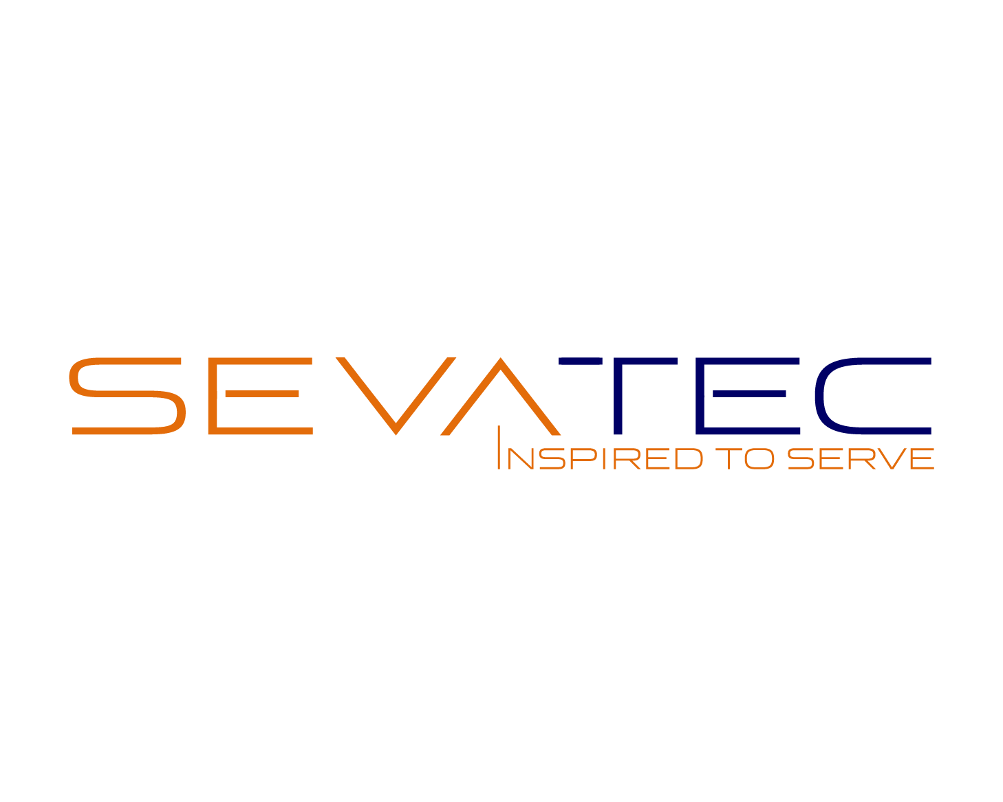
The new logo design was based on a number of attributes: authentic, leading-edge, modern, service oriented, growing. Those attributes shine throughout:
- Thin, modern typeface with sleek breaks between certain letters
- Accent on “service” through addition of company’s tagline — “Inspired to Serve” — as well as accented color on “Seva” which means “service”
- Use of subtle up arrow through the combination of the “A” in Sevatec and the “I” in the tagline meant to stress the notions of leading-edge and growing
The updated logo will help usher Sevatec into its growing status, to help attract the best talent in the industry to come work for Sevatec, and to attract existing and potential new clients to hire Sevatec for its professional nature, its proven experience and expertise to help the company grow even further.